City of Melbourne Logo

Richard Pendavingh

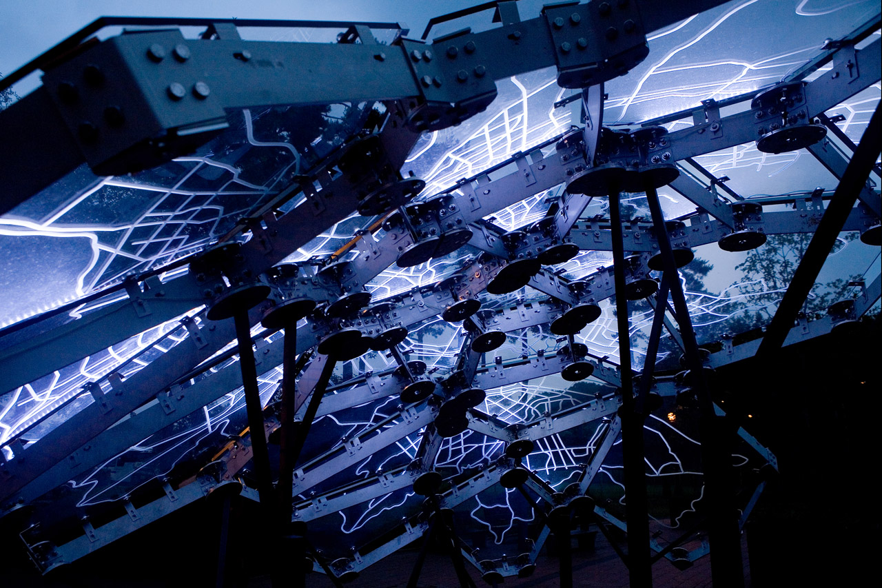
The City of Melbourne has unveiled its new corporate identity this week. Designed by Landor, one of the largest marketing and design agencies in the world, the new identity is designed to be "synonymous with the modern, vibrant, cool city Melbourne is today and will continue to be in the future" according to our current Lord Mayor, Robert Doyle. The new logo definitely ticks the 'cool' and 'modern' boxes but it doesn't reflect the history of the city and says very little about the lifestyle of its residents.

read more
Jul
14
2009
Losing Face Richard Pendavingh 14.07.09

I'm all for removing dickheads from companies but the re-brand for Dick Smith Electronics seems a bit light on personality.

Aug
12
2008
East Timor: Part 3 Richard Pendavingh 12.08.08

In the evening I'm starting to feel like I have a monumental hangover. Which is a marked improvement over what I was feeling at the start of the day.

Pop-anthropology piped straight to your inbox

Our newsletter might not always be on time but it’s always interesting.

Patronise us for a change.

We don’t like ads and we don’t want to sell cookies that no one can eat. That means we need donations.

With your support we can pay contributors and keep the little light on our server blinking.


Become a patron
Aug
11
2008
East Timor: Part 2 Richard Pendavingh 11.08.08

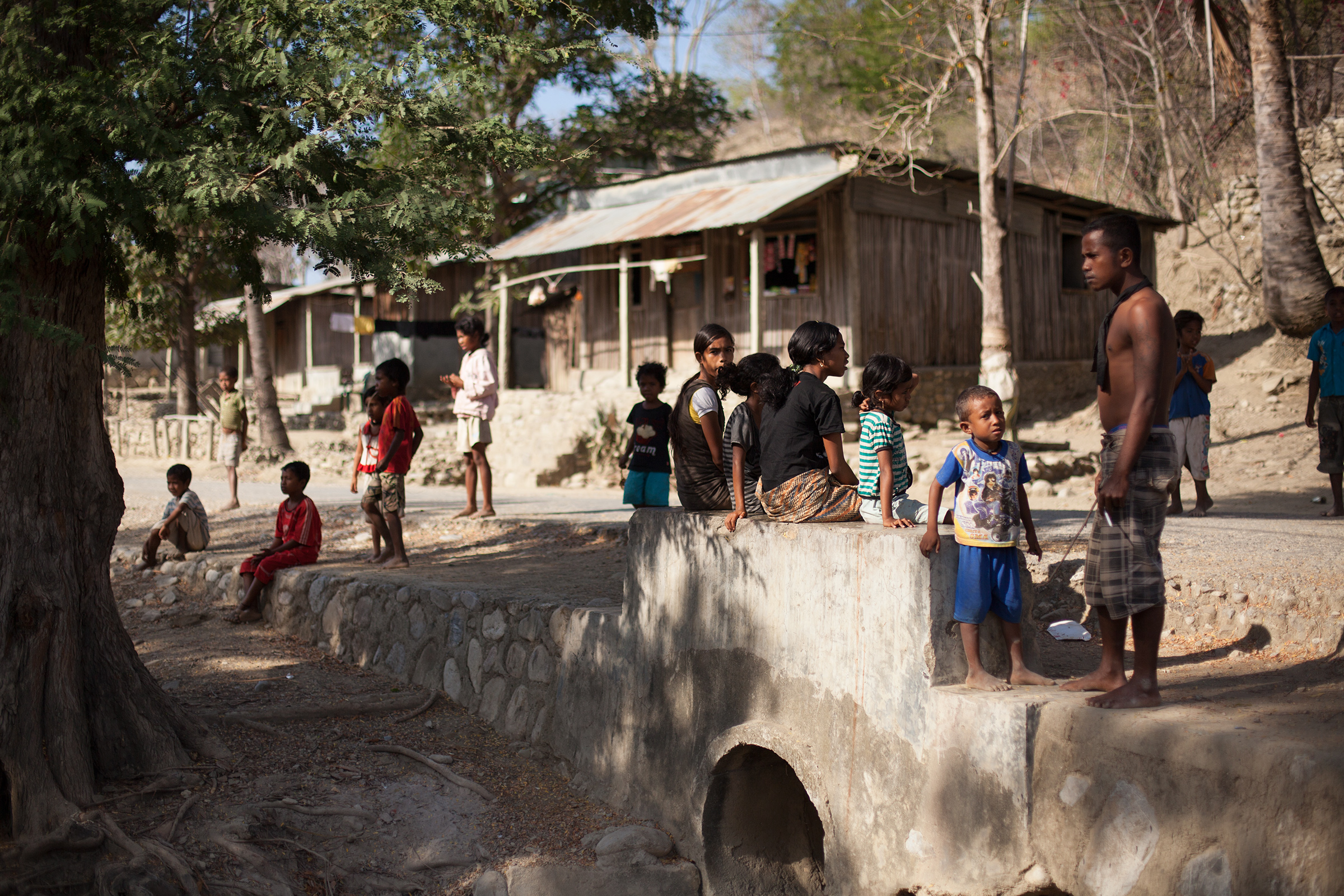
When the locals see us they generally stop and stare. The children wave or squeal or shout 'malae!' or 'malae mutin!'

Aug
10
2008
East Timor: Part 1 Richard Pendavingh 10.08.08

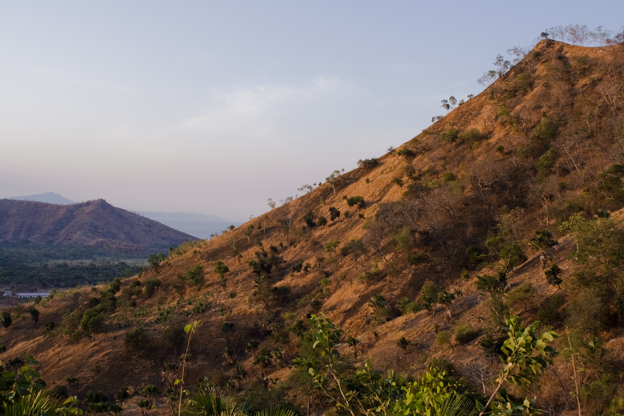
In 2008 I went to East Timor with some volunteers from my high school to install an electrical system for a school in a village called Zumalai on the south coast. We brought over some tools and electrical equipment and I brought back a few words in Tetum and a cute little tropical parasite.

Jul
26
2008
Welcome Richard Pendavingh 26.07.08

When I started it this site was dedicated to inspiring work in any medium. It was a chance for me to share news and resources with other creative types and let people know what I'm working towards and where I'm coming from. Since that time it's turned into a bit more of a diary/travelogue with the occasional essay thrown in for good measure. As it turned out the world of commercial design doesn't lend itself to nice debriefs on the creative process. That being the case, I tended to steer the blog towards showcasing artwork and design projects by people that I found inspiring. I also posted my own photos occasionally- but usually months or years after the fact. In 2015 when it came time to re-design and overhaul the site I went back and re-visited those old posts hoping to update the images or find higher-res versions and was thrilled to re-discover those artists and see how their work had evolved in the intervening years. I still work as a designer. I still shoot when I get the chance. It still takes me ages to get around to processing my photos.