Logotype; Jacob Battista

As a freelancer and sole trader the most important part of Jacob’s business identity was ensuring that clients had a visual cue for the work that he does. I thought the business card format would fit well with a graphic of a sound mixing desk so I took a few creative liberties with a sound desk and made a vector illustration in a number of colour schemes.
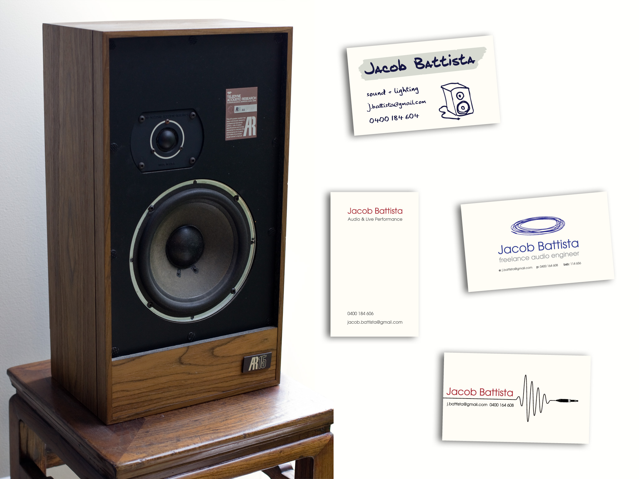


Masking tape and sharpie labels are also an occupational hazard so I also did one proof with a hand-written logotype and a more informal feel to it.
For the face of the card I experimented with imagery like mic inputs and audio jacks and a waveform created by a mic lead but in the end Jacob chose to go with a simple minimalist logotype. The face represents white light and the reverse represents sound.
Leave a Reply