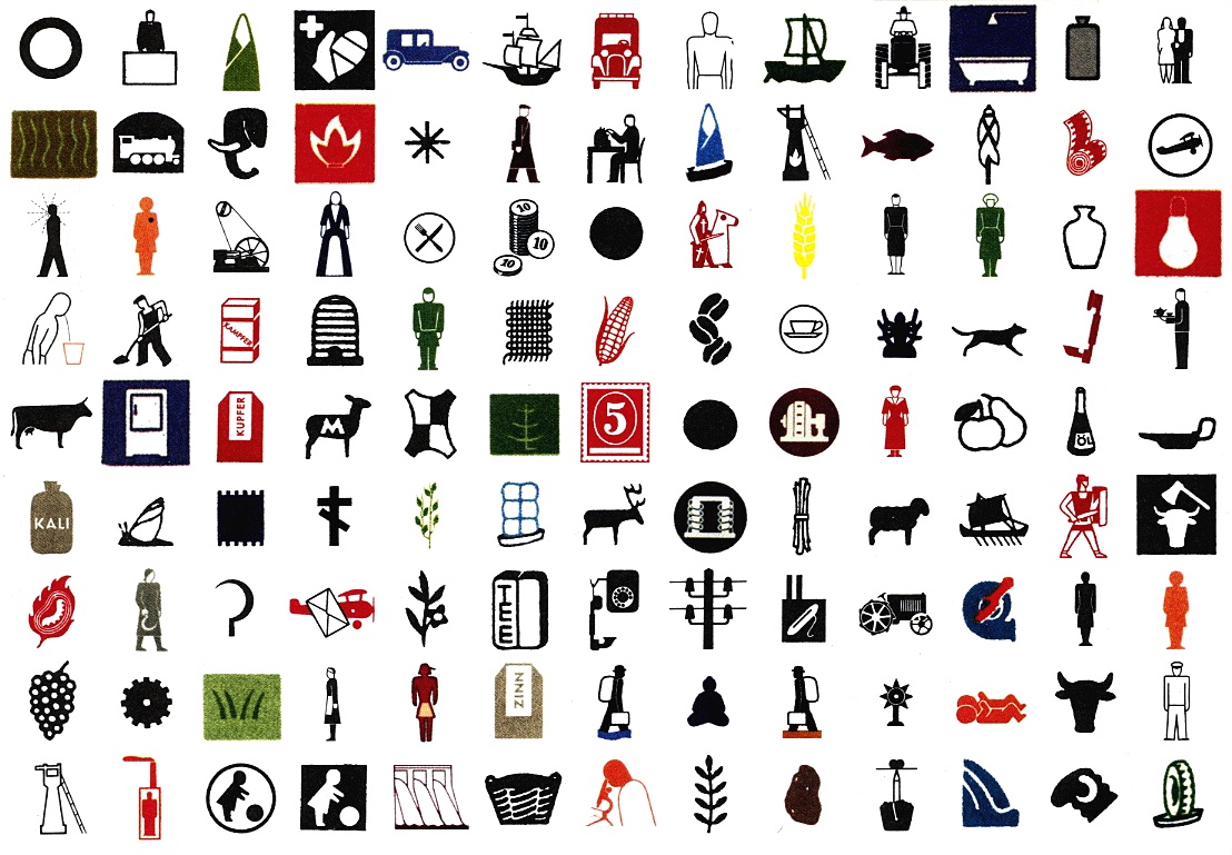
Gerd Arntz

Born in 1900, Arntz spent most of his artistic life committed to highlighting social injustice and class struggle in Europe as it dealt with the aftermath of the Great War and the rise of fascism. As one of the first students of Otto Neurath in Vienna Arntz worked to devise a standardised visual language for rendering statistics and complex ideas. This system, known as ISOTYPE, favoured simple, intelligible pictograms to represent ideas and was supported by a set of guidelines that promoted clarity and concision. A great deal of modern graphical icons, infographics, wayfinding signage and statistical charts are heavily influenced by Neurath’s convictions and Arntz design skills. The principle that underpinned ISOTYPE was that “To remember simplified pictures is better than to forget accurate figures”.
Arntz eventually designed about 6000 individual pictograms while working on the ISOTYPE project and what’s remarkable is just how readily identifiable the figures are despite the very simple shapes and line work. There’s just enough detail to get the message across but not enough to create confusion. They are stereotypes in the traditional sense of the word.
Much like a good logo design these pictograms demonstrate the restraint of the designer and a really instinctive understanding of how we perceive and recognise objects around us.
They also serve as a nice time capsule of 40s and 50s fashion because these illustrations, more than others, have a certain truth to them because Arntz couldn’t afford to take too many liberties with the furniture and dress and hair styles because he wanted them to be universal figures. For example the social status of the women in the illustration below is indicated by posture, hem line,bag size and the style of the hair and shoes. These details are subtle but still detectable at a glance.
Find out more about Gerd Arntz here and find out more about ISOTYPE here.


Leave a Reply